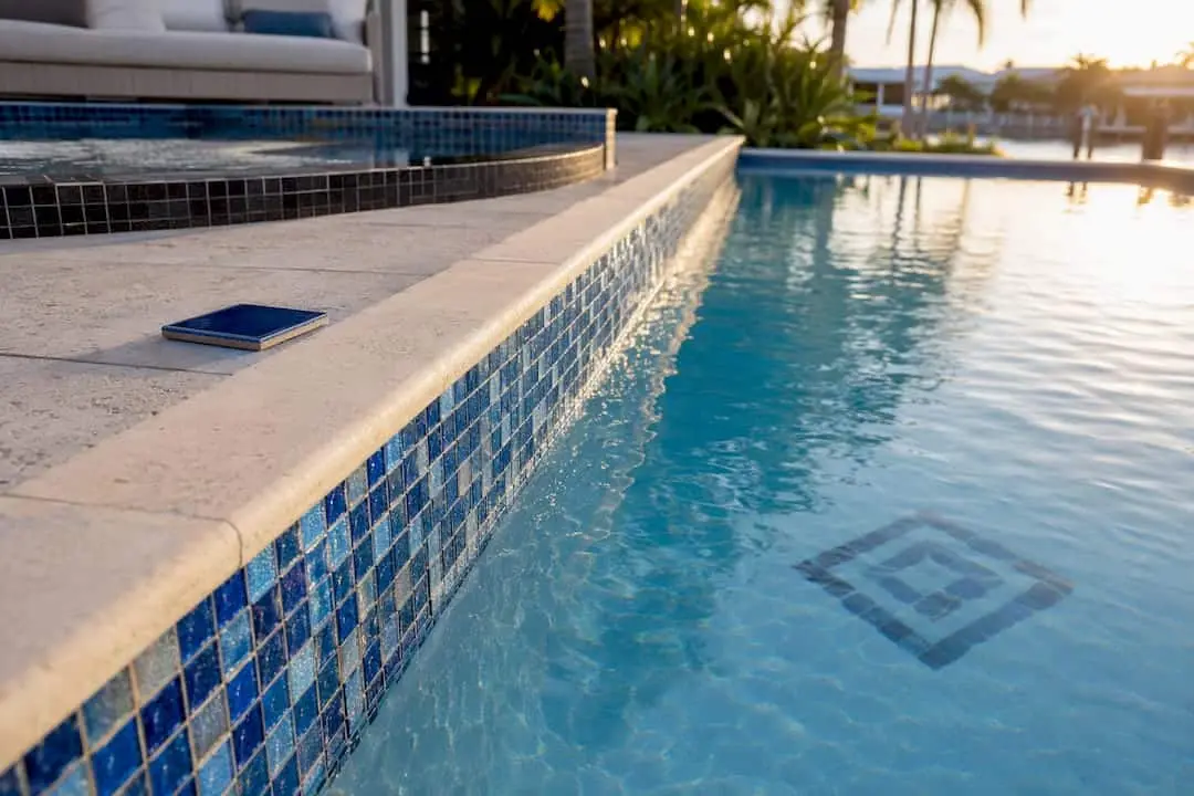
Spend most of your tile budget on the waterline band and one hero accent, whether that’s the spa wall, the steps, or a spillway. The strongest pattern directions right now are mosaic art bands, deep charcoal minimalist stripes, terrazzo-look mosaics, bold geometric borders, hand-painted Mediterranean patterns, and iridescent gradient bands. Use glass for anything you want to shimmer, porcelain for large-coverage areas, and natural stone where you want a warmer, more organic feel.
TL;DR:
- Prioritize the waterline band and one hero accent, such as a mural or geometric border, to maximize visual impact without overwhelming the pool design.
- Use glass tiles for shimmer at water level and porcelain for larger areas to balance cost, durability, and aesthetic needs.
- Dark colors like deep charcoal or black in gloss finishes create modern, reflective pools, while lighter or iridescent tiles add movement and brightness.
- Pattern complexity should be matched with suitable backing systems and grout choices to ensure long-term durability and prevent issues like loose tiles.
- Limit the number of pattern types to two or three to maintain a cohesive, high-end appearance and avoid cluttered visual chaos.
Table of Contents
- Pool Tile Pattern Ideas Ranked By Visual Impact
- Glass, Porcelain, Or Stone: Matching Material To Location
- How Tile Color Changes The Way Your Pool Water Looks
- Choosing Tile Size And Layout So Patterns Read Correctly
- 2026 Tile Trends Worth Using (And The Ones To Use Carefully)
- How To Choose The Right Pattern For Your Pool And Home
- Why Professional Installation And Resurfacing Matter
- Keeping Pool Tile Patterns Durable Over Time
- Coordinating Tile Patterns With Landscaping And Pool Design
- How Lighting Changes The Way Tile Patterns Read
- Mixing And Matching Patterns Without Creating Visual Chaos
- What Actually Holds Up Over Time In Pool Tile Design
- Ready To Bring Your Tile Pattern Ideas To Life
- Where To See More Pool Tile Pattern Examples
- Sources
Pool Tile Pattern Ideas Ranked By Visual Impact
Not every square foot of tile deserves equal attention. The waterline band is the thin strip most people actually notice from a lounge chair or the kitchen window, and it’s the highest-ROI place to spend on pattern and material because it covers so little area for so much visual payoff. Here are the ten pattern directions worth considering, ranked loosely by how much design impact they deliver relative to cost.
1. Classic blue mosaic waterline. A traditional glass mosaic in cobalt or aqua tones along the waterline remains the safest high-impact choice. It reads as “pool” instantly, works with almost any deck material, and a 12×12 mesh-mounted sheet installs quickly around curves. Budget impact is moderate since you’re only tiling a narrow band.
2. Deep-charcoal minimalist band. Swap blue for a matte charcoal or graphite porcelain strip and the whole pool shifts toward a modern, architectural look. This pairs well with black or gray Pebble Tec® interiors and contemporary landscaping. It’s a subtle move that reads as expensive without actually costing much more than a standard waterline job.
3. Iridescent gradient band. Iridescent glass tiles shift from teal to violet to gold depending on the sun angle, adding motion to an otherwise static strip. It’s one of the more attention-grabbing 2026 pattern moves, best reserved for the waterline or a small spa accent rather than a full surface, since a large expanse of shifting color can feel busy from a distance.
4. Terrazzo-look mosaic. Small glass fragments in mixed sizes and tones create a speckled, terrazzo-inspired surface that reduces the need for a hard grout grid. This look has strong momentum for 2026, largely because it lets a pool feel textured and custom without the labor of a true hand-set mosaic mural.
5. Penny-round retro tile. Tiny round glass or porcelain “pennies” follow curves naturally, making them ideal for rounded steps, spa walls, or a freeform pool shape. The retro association is real, but in a matte earth tone it reads as intentional rather than nostalgic.
6. Black-and-white checkerboard. A graphic checkerboard pattern on steps or a tanning ledge creates strong contrast and works especially well in Mediterranean or modern coastal architecture. Keep it contained to one feature area. A full-pool checkerboard is a bold commitment that can overwhelm smaller pools.
7. Elongated subway running bond. Long, narrow porcelain tiles laid in a running bond emphasize horizontal lines, which visually widens a narrow pool or spillway wall. It’s a low-drama, high-durability choice for homeowners who want texture without a busy pattern.
8. Hand-painted Mediterranean border. Hand-painted or hand-glazed porcelain tiles in a repeating floral or geometric border suit Spanish, Tuscan, or coastal homes. Porcelain’s stable body holds glazes and printed patterns consistently, which is why it’s the preferred base for this look rather than glass.
9. Large-format stone-look band. Large-format porcelain planks that mimic travertine or limestone minimize grout lines and give the waterline a quieter, more architectural presence. This suits homeowners who want texture and warmth without the upkeep that real stone demands underwater.
10. Bespoke tile mural or inlay. A custom mural, whether a geometric medallion on the pool floor or an inlaid crest on the spa wall, is the highest-cost, highest-impact option on this list. Tiled murals require careful planning around sightlines and sun position, but nothing else on this list creates the same “this pool was designed, not just built” impression.
If you only take one thing from this list: a well-chosen waterline band paired with a single hero accent, whether that’s a mural on the spa wall or a checkerboard step, outperforms a pool where every surface competes for attention. Browse a few pool tile design galleries before you commit, since seeing a pattern at scale changes how it reads compared to a small sample chip.
Glass, Porcelain, Or Stone: Matching Material To Location
Every pattern idea above depends on picking the right material for where it’s going. Glass, porcelain, and natural stone behave differently underwater, and mismatching material to location is one of the most common (and expensive) mistakes homeowners make.
- Glass tile is nonporous and luminous, which is why it’s the standard recommendation for waterline bands, steps, and spa walls where you want shimmer and depth. It costs more per square foot and demands a skilled installer, particularly for large-format crystal glass sheets that need precise leveling.
- Porcelain tile is dense, frost-resistant, and far more cost-efficient once you’re covering larger surfaces. It also takes stone-look finishes and printed glaze patterns well, making it the practical choice for tanning ledges, sun shelves, or a full-perimeter band.
- Natural stone brings an organic warmth that manufactured tile can’t fully replicate, but it needs sealing, careful sourcing for consistent color, and ideally matching coping so the transition from pool edge to deck feels intentional rather than accidental.
- Mixed approach: porcelain across the bulk of the interior with a glass waterline band is the most common mid-budget strategy, delivering visual punch exactly where eyes land without paying glass prices across the whole pool.
For most residential projects, that glass-and-porcelain combination hits the sweet spot between durable material choices and a design that still looks custom.
How Tile Color Changes The Way Your Pool Water Looks
Tile color doesn’t just decorate the pool. It actively changes how the water reads to the eye, sometimes more dramatically than the water treatment itself.
Color effect at a glance: Blue tones push water toward a brighter, “clearer” appearance and a classic resort feel. Deep charcoal or black tile creates a mirror-like, reflective surface that has become a signature look for modern minimalist pools. Green and jade palettes shift water toward a natural, pond-like tone that suits biophilic or tropical landscaping. Iridescent and pearlescent finishes add movement, changing color as the sun shifts across the surface.
Finish matters as much as hue. A glossy glass tile bounces light and amplifies color saturation, while a matte or textured porcelain surface diffuses light and reads calmer, less reflective. If you want a dramatic evening pool that looks black and glassy under landscape lighting, charcoal tile in a glossy finish gets you there faster than any water chemistry adjustment.
Choosing Tile Size And Layout So Patterns Read Correctly
Tile format and layout decide whether a pattern looks intentional or accidental once the water settles and light hits it.
- Micro formats like 1×1 mosaic chips and penny-rounds add texture and are the only practical choice for tight curves, rounded steps, and spa coves.
- Elongated subway shapes emphasize horizontal lines, which helps a narrow pool or spillway wall feel wider.
- Large-format tile reduces grout lines and reads more architectural, especially for waterline bands on modern pools.
- Layout choices carry their own message: a running bond feels fluid, a checkerboard is graphic and bold, and a medallion or radial pattern creates a deliberate focal point on a step or floor.
- Grout color and joint width quietly control perceived scale. Tighter joints and grout that matches the tile color make a pattern feel calmer and more unified from a distance.
2026 Tile Trends Worth Using (And The Ones To Use Carefully)
The Coverings trade event’s top tile trends for 2026 are showing up in pool design as textured “articulated” accents, terrazzo-look mosaics, jade and green palettes, metallic details, micro-illusion small formats, and tile treated outright as art rather than as background finish.
- Safe as accents: metallic glass tiles and micro-illusion mosaics work well in small doses, like a spa wall or a border strip, without overwhelming the pool.
- Riskier as full-surface choices: an entire pool clad in jade-green tile or heavy texture can feel more like a statement piece than a swimming pool, and statement pieces age faster than neutral ones.
- Terrazzo-look mosaics and large-format crystal glass sit in the middle. Both reduce visible grout and read as current without being tied to a single passing aesthetic.
The safest strategy is applying a trend to one contained area, the waterline or a single feature wall, rather than the whole pool. A trend-forward accent is easy to update in five years. A trend-forward entire pool is a five-figure redo.
How To Choose The Right Pattern For Your Pool And Home
Run through this checklist before you lock in a design, whether you’re briefing yourself or a contractor.
- Match tile to home architecture. A Mediterranean-style house calls for hand-painted borders and warm tones; a modern glass-and-concrete home calls for charcoal minimalism or large-format stone-look porcelain.
- Factor in your climate. Freeze-thaw cycles stress grout and adhesive differently than a year-round warm climate, which affects which backing systems and grout types your installer should recommend.
- Allocate budget by impact, not by area. Fund the waterline and one hero accent first; let the bulk interior finish carry the rest of the surface.
- Check slip resistance, especially on steps, sun shelves, and spa walls where feet are wet and bare.
- Confirm backing and adhesive systems before signing off on any glass mosaic, since the wrong system underwater leads to tiles popping off years later.
Pro Tip: Ask your contractor specifically what backing system they use for glass mosaic below the waterline. Factory-applied polyurethane-backed sheets hold up far better in submerged, chemically active water than generic mesh backing, which can degrade over repeated wetting cycles.
Red flags worth walking away from: mesh-backed glass tile proposed for fully submerged applications without a pool-rated backing system, vague answers about grout type, or a contractor who can’t produce installer references or a written warranty.
Why Professional Installation And Resurfacing Matter
A worn or dated waterline band is often a cosmetic fix. Broken tiles, spreading cracks, or a plaster surface that’s chalky and rough usually signal it’s time for full resurfacing rather than a spot repair. The company has extensive experience resurfacing pools and significant expertise in matching new tile patterns to fresh interior finishes rather than treating tile as an afterthought. A typical tile-focused renovation starts with an on-site inspection, a written estimate, and a realistic timeline before any demolition begins.
Keeping Pool Tile Patterns Durable Over Time
Pattern complexity and durability are connected, whether homeowners realize it going in or not. A hand-painted Mediterranean border or a bespoke mural has more individual pieces and more grout joints than a large-format band, which means more seams where water, chemicals, and sun exposure can eventually work grout loose. That doesn’t make intricate patterns a bad idea. It just means the backing system and grout choice matter more as pattern complexity increases.
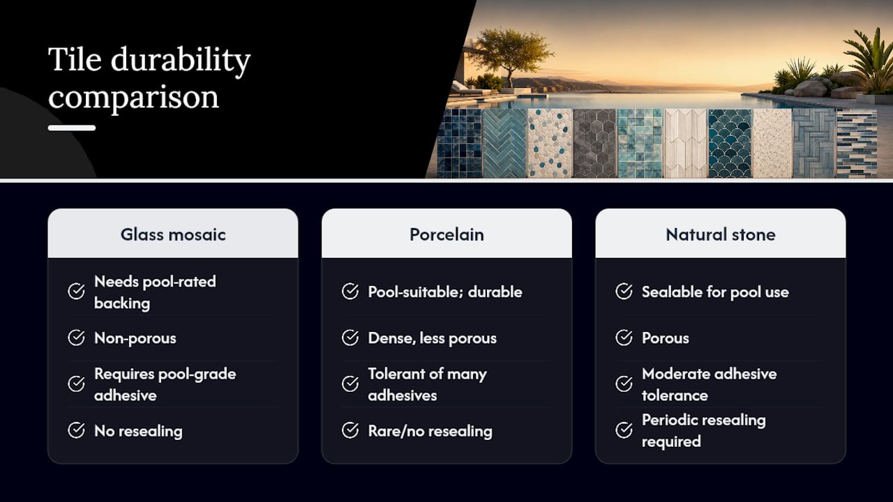
Glass mosaic sheets need a pool-rated adhesive and backing designed for constant submersion, not a generic tile-setting product borrowed from a bathroom job. Porcelain, being denser and less porous, tolerates a wider range of adhesives and holds up well even in busy commercial settings. Natural stone needs periodic resealing to resist staining from chlorine, algae, and mineral deposits, particularly in a lighter-colored stone where discoloration shows fastest.
Grout color choice affects maintenance visibility as much as it affects looks. Lighter grout shows algae and mineral buildup faster than a mid-tone gray, which is why many designers now default to a grout shade close to the tile color rather than a stark white. Routine brushing along the waterline, where sunscreen residue and biofilm accumulate fastest, keeps any pattern looking sharp regardless of how ornate it is.
Coordinating Tile Patterns With Landscaping And Pool Design
Tile choice never happens in isolation. The strongest results come from specifying tile, decking, and coping together rather than picking tile first and hoping it works with whatever surrounds it. Designers who pair the tile palette with coping and surround materials, whether that’s travertine, limestone, or a poured concrete deck, consistently produce more cohesive, photograph-ready results than those who treat tile as a standalone decision.
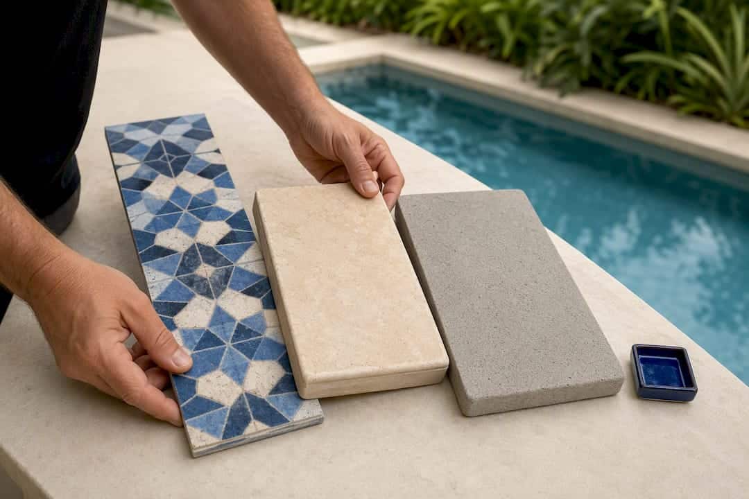
Color temperature is the detail most homeowners miss. A cool charcoal waterline against warm beige travertine coping can look disjointed up close, even though each material looks great on its own. Matching warm tones to warm tones, or intentionally contrasting cool tile against warm stone as a deliberate design move, prevents that mismatch.
Planting beds and hardscaping matter too. A jade or green-toned tile palette reads as natural and tropical next to lush landscaping but can look flat against a stark, minimalist gravel yard. Conversely, a charcoal minimalist band suits a modern landscape of clean lines and architectural plants far better than it suits a cottage garden setting.
How Lighting Changes The Way Tile Patterns Read
The same tile pattern can look completely different at 2 p.m. and 9 p.m., which is why lighting deserves its own line item in the planning process, not an afterthought after installation.
Glass tile amplifies underwater LED lighting more than porcelain does, since its glossy surface reflects and scatters light rather than absorbing it. That makes glass waterlines and glass mosaic accents especially dramatic once pool lights come on at night. Iridescent finishes take this further, since their color shift depends on light angle. The same tile that looked teal at noon can flash gold under a low evening sun or a warm-toned pool light.
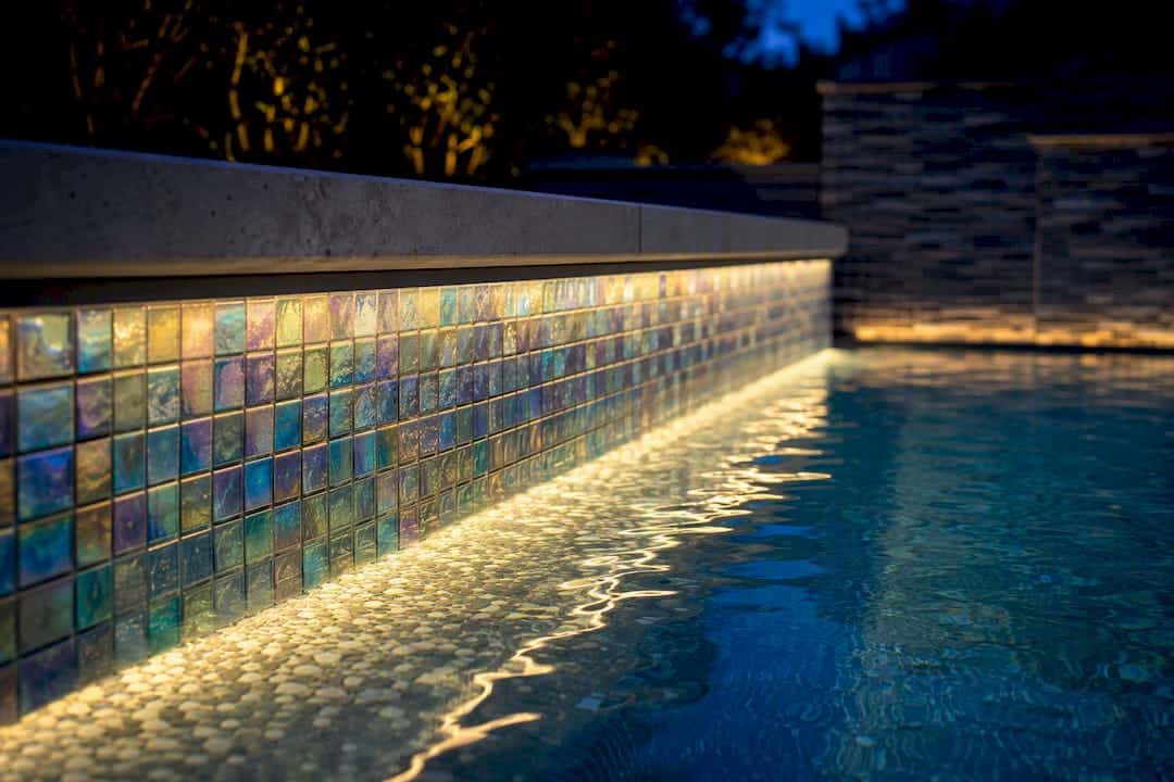
Porcelain and stone, by contrast, hold their color more consistently across lighting conditions, which makes them more predictable but less theatrical after dark. Matte finishes diffuse both natural and artificial light, softening glare around a sun shelf or tanning ledge where people are lying close to the surface. Landscape and deck lighting placed to graze across a textured or terrazzo-look surface can also emphasize dimension that’s barely visible in daylight, which is worth testing with a sample board and a flashlight before finalizing a feature wall.
Mixing And Matching Patterns Without Creating Visual Chaos
The pools that look the most expensive rarely use more than two or three pattern moves total. A common, reliable formula: one pattern for the waterline, a complementary but simpler material for the bulk interior, and one hero accent elsewhere, like the spa wall or a step medallion.
Keep a consistent color family running through every element you mix. A charcoal waterline, a light gray interior, and a graphite-toned checkerboard step share enough tonal DNA to feel coordinated even though the patterns themselves differ. Mixing unrelated color families, say, a warm terracotta border with a cool teal waterline, tends to read as unplanned rather than eclectic.
Scale contrast works better than pattern contrast. Pairing a micro-format penny-round accent with a large-format porcelain field creates visual interest through size difference alone, without needing two competing motifs fighting for attention. Save the boldest, busiest pattern, whether that’s a mural or a full checkerboard, for the smallest surface area in the design. A little goes further than most homeowners expect.
What Actually Holds Up Over Time In Pool Tile Design
The gap between an Instagram-worthy pool tile photo and a pool that still looks sharp in ten years usually comes down to restraint, not trend awareness. The most durable design decision in this entire article is the simplest: fund the waterline band and one accent well, and let the rest of the pool support that focal point instead of competing with it.
Conventional advice tends to treat every 2026 trend as equally usable, when in practice metallics and micro-illusion formats age fine as accents while a full-surface trend commitment, like an all-over jade palette or wall-to-wall articulated texture, ties the pool to a specific moment in design history. Homeowners rarely regret a bold waterline. They sometimes regret a bold everything.
Prioritize the backing system and grout specification before you fall in love with a pattern. A gorgeous terrazzo-look mosaic installed with the wrong adhesive underwater is a five-year problem wearing a nice photo. Get the material science right first, then let the creative choices follow.
— Results
Ready To Bring Your Tile Pattern Ideas To Life
Planning a pattern on paper is one thing. Getting a glass waterline band, a mosaic accent, or a full remodel installed correctly on a live pool shell is another, and it’s where a contractor’s actual field experience shows. The company has extensive experience resurfacing pools in the Florida region, coordinating tile selection, resurfacing material, and design detailing as one project rather than separate jobs handed to different crews.
If your waterline tile is cracked, dated, or simply doesn’t match the pool you’re picturing, the next step is a free estimate rather than another round of browsing sample boards. An in-person inspection lets a project manager confirm backing systems, grout options, and realistic timelines specific to your pool’s condition. Start with a free estimate for pool resurfacing in Orlando to see how your tile pattern ideas translate into an actual project scope and schedule.
Where To See More Pool Tile Pattern Examples
- Browse current pool tile trend coverage for context on where the aesthetic is heading.
- Review residential pool galleries for real installed examples.
- Read the design guide to tile’s role in pool aesthetics for deeper material and finish context.
Sources
- Poolmagazine
- Glass pool tile trends 2026 | Works of Stone
- Glass vs porcelain pool tile buyers guide | e-architect
